The Imaginarium
In crafting The Imaginarium’s logo, it was more than design; it was a commitment to creating a visual identity that resonated with the transformative spirit of community outreach.

About the process
The logo design for The Imaginarium, a community outreach company, was a journey into the heart of empathy, connection, and the transformative power of community engagement. The aim was not just to create a visual identity but to craft a symbol that echoed the warmth and inclusivity of The Imaginarium.
Before the first sketch, I delved into conversations with the passionate minds behind The Imaginarium. It was essential to grasp the heartbeat of their community outreach initiatives—their aspirations, their dreams, and the essence of their connection with the community. This understanding became the compass guiding the design process—a commitment to encapsulate the spirit of The Imaginarium in every stroke.
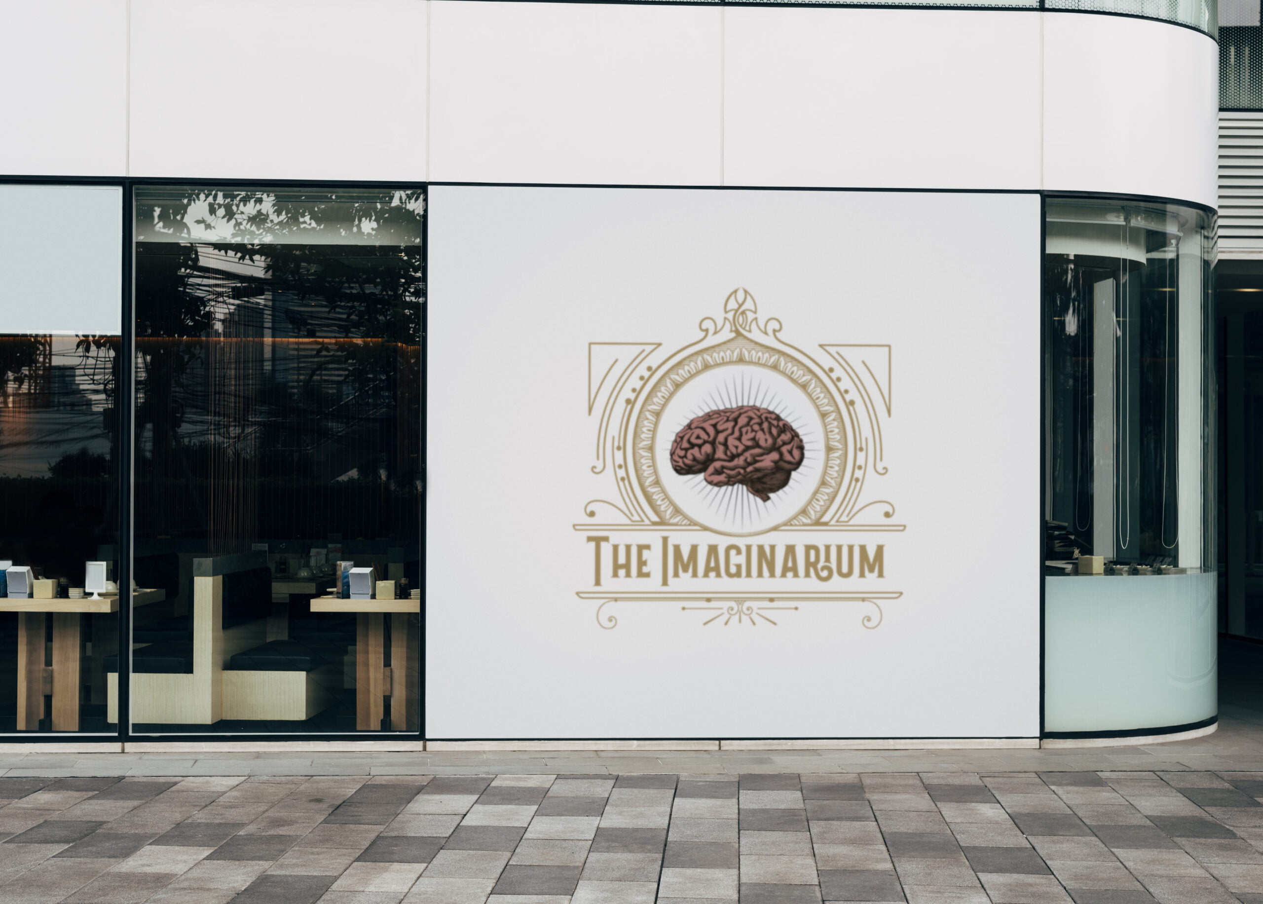
The chosen brand colours—black and gold—were not just a visual decision; they were a language. Black, a canvas of sophistication and elegance, symbolises the strength and resilience embedded in community bonds. Gold, warm and inviting, represents the compassion, understanding, and transformative impact of The Imaginarium’s outreach. Together, they formed a palette that reflected the balance between strength and warmth within the brand.
In the choice of typography, a Sans Serif font was chosen for “The Imaginarium,” conveying a modern, clean, and approachable identity. To infuse a touch of timeless elegance, elements of Art Deco were incorporated into the border of the logo. The fusion of modern simplicity and classic design elements created a unique visual language that spoke to The Imaginarium’s commitment to both contemporary connection and timeless values.
Creating an intuitive and user-friendly navigation experience was paramount. The website structure was designed to guide visitors seamlessly through the various community outreach initiatives of The Imaginarium. Each section unfolded like chapters, inviting users to explore the compassionate landscape that the organisation cultivates within communities.
Beyond functionality, the logo became a canvas for visual storytelling. The brain graphic, a symbol of imagination and connectivity, was carefully designed to reflect the transformative power of community outreach initiatives. Each element, from the Sans Serif font to the Art Deco border, served as visual cues that conveyed the richness of The Imaginarium’s mission—a compassionate tapestry woven with threads of connection.
Understanding that the logo would be encountered across various mediums, the design embraced responsiveness. Whether viewed on a business card or a digital platform, the visual identity remained consistent. The responsive design ensured that The Imaginarium’s logo adapted seamlessly to every context, ensuring a unified experience across the brand landscape.